Blueprint: A Case Study
An in-house built, complete design and engineering framework for building a set of proprietary single page web applications.

Introduction
Blueprint (BLUE) is an in-house built, complete design and engineering framework for building a set of proprietary single page web applications which encompass:
- Engineering-based web calculators
- Product selectors
- Product finders
- Report generators
Project Goals
- The project was initiated to replace the current stable of Simpson Strong-Tie engineering, single page web applications with a user-centric, modern tech-stack based update.
- Blueprint applications will feature responsive layouts, real-time calculations, and modular component-based construction to facilitate speedy development.
Problems with Existing Applications
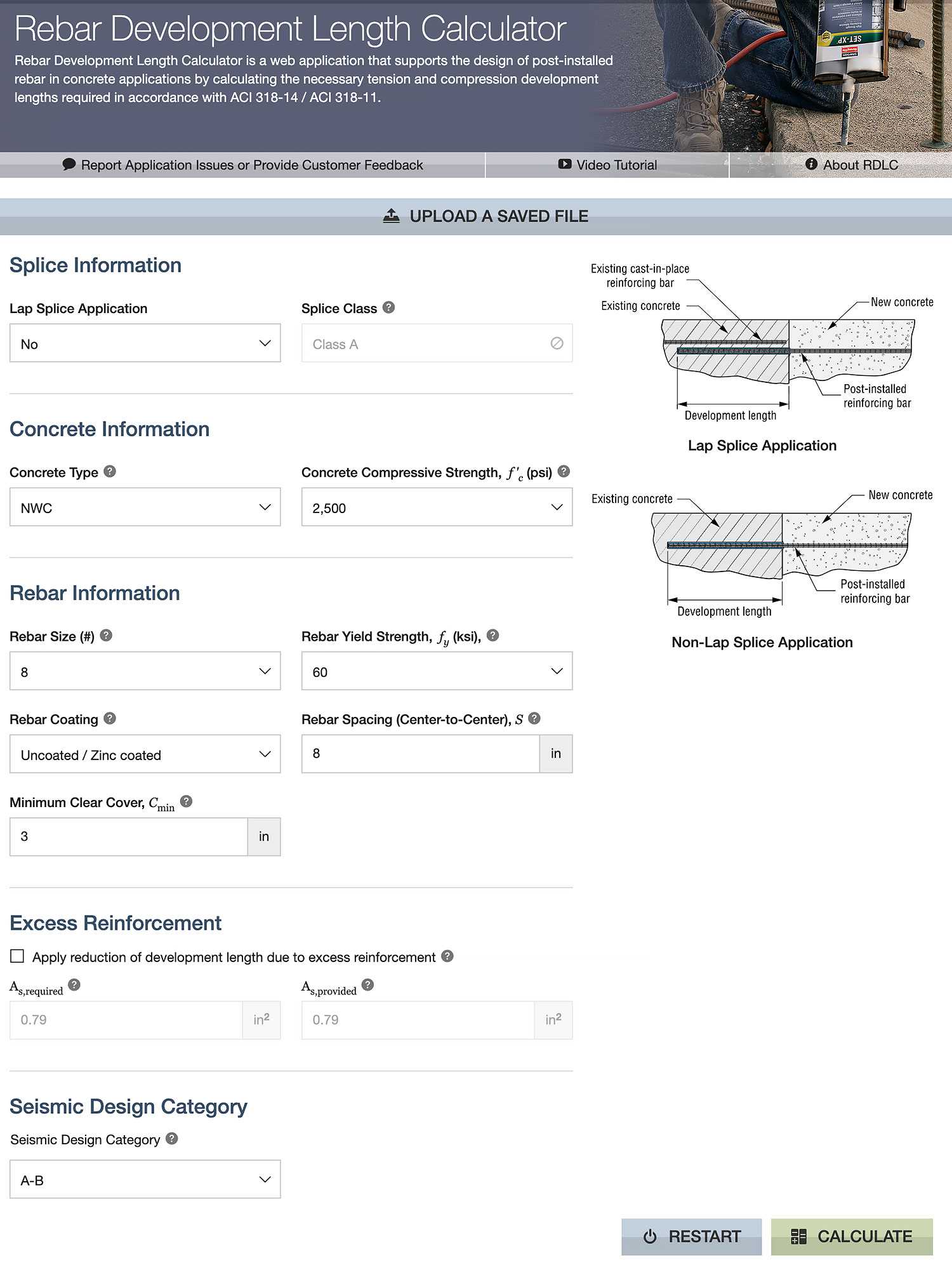
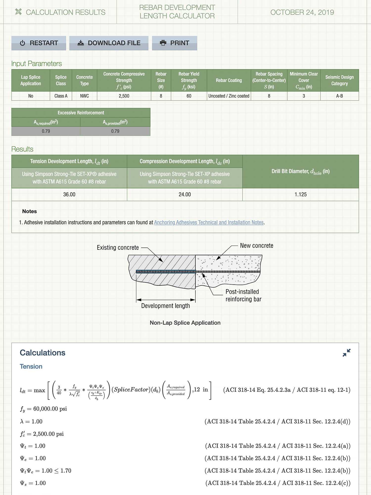
The non-mobile friendly UI featured a pseudo-skeuomorphic look that was dated and in need of a refresher.

Simpson Strong-Tie web applications were in need of a reboot from both an engineering as well as UI/UX perspectives. The applications were built on legacy technology (.NET MVC and .NET ASP Webforms) which was slow during run-time execution and laborious to develop. The non-mobile friendly UI featured a pseudo-skeuomorphic look that was dated and in need of a refresher.
Poor User Experience
The legacy web applications had many shortcomings in terms of the user experience, which became pain points for engineers and customers, alike. These problems stemmed from years of design and development that focused on providing the same basic user flow, which only received updates periodically in terms of visual style.
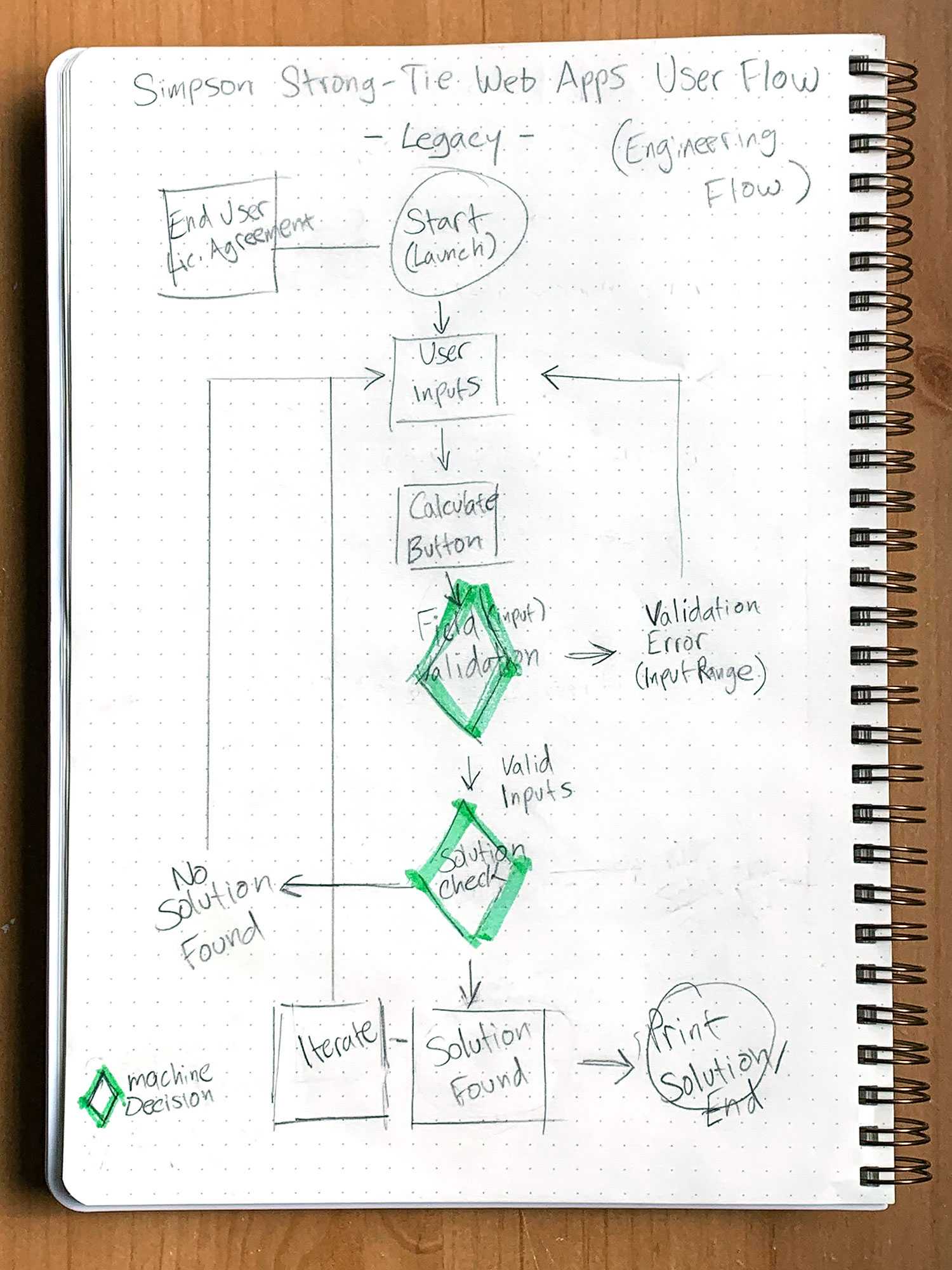
The Calculate Button Chokepoint
The “Calculate button” had become a chokepoint for the user’s journey through the application as it gated any potential solutions by needing all required inputs to be correctly entered before a calculation could be made via a “waterfall” typology. Further complications could be seen in apps where a data input would not be validated against out-of-range or invalid inputs until a calculation was made.

The Input and Output Relationship
The input and output sections presented a challenge for the user to navigate as both were typically very lengthy and followed each other vertically on the screen. This combination forced the user to toggle between viewing their inputs and the respective outputs by scrolling up and down. This proved to be problematic for clients that were using a “Trial and Iterate” type of problem solving where they would be bouncing up and down between the input and output often. It was obvious from this future UX updates must address smooth and quick viewing of input and output sections.
Not Built for Mobile Responsive Web
The legacy applications received their last major update in 2014. At that time, mobile usage was not deemed a priority by the stakeholders and therefore the apps maintained a fixed-width wrapper until the Blueprint project was given the blue-light to commence. During the five years in between, mobile usage at Simpson Strong-Tie has increased 32% and our customers have expressed through our app’s feedback forms the desire for mobile-ready versions.

Wasted Space
The legacy applications suffered from a large amount of wasted screen real estate on the left and right from being contained within the main site’s wrapper. Furthermore, extraneous components such as the site’s header which featured an all too large logo and the main navigation pushed the start of a web application down 300 pixels. Lastly, the site had a massive footer as well which provided little value to the user of the web applications. These areas represented a prime target to help solve the input and output relation challenge.
Pre-Research: Low Fidelity Wireframe Sketches

Prior to user research, the design team was tasked with creating an initial comprehensive layout to explore hypotheses regarding better user flows and interactions with the application. The rationale for this pre-research process was an aggressive timeline for the start of the application development once engineering resources became available in summer 2019. This process was quick and dirty and comprised mainly of whiteboard wireframe sketches which were used to try and tackle some of the more pressing issues such as the input/output relationship and the proper abstraction of input sections to work in a mobile context.

Pagination to the Rescue?
We discovered the majority of inputs and outputs could be chunked into similar sections which allowed for abstraction through pagination. This method of solving linear, long form processes was similar to the approach Turbo Tax used. At this time, we felt pagination would focus the user on a small set of form inputs that could be well represented on a mobile device. Apps would have a limited number of inputs per screen (6 or less was a number we thought to be a good starting point). Additional inputs will be abstracted into additional sections or chapters depending upon their hierarchy and importance.
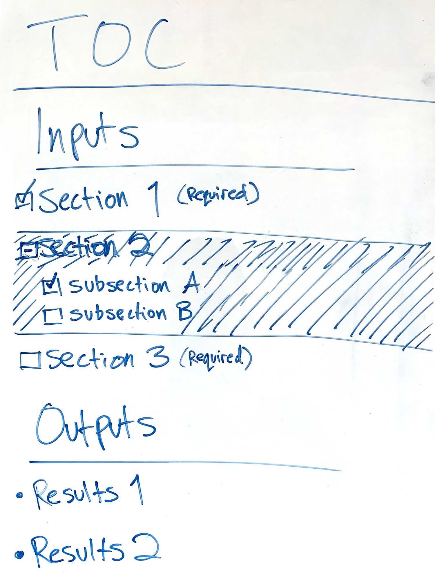
Table of Contents
One item which looked like a potential problem was the massive amount of inputs found on some applications which were given the nickname, a “lunar lander cockpit” approach to interface design. Moreover, it appeared that a user could easily get lost in the sea of inputs and not easily see which were required and which were optional for a successful output calculation.
The design team’s initial solution was to provide a left-hand rail, table of contents. This TOC would provide the following functionality:
- Users could instantly see which inputs would be required by a flag or similar UI design pattern.
- The user could skip to any section on the application whether it be in an input or output with ease.
- The overall level of completion of inputs would be indicated in the left-hand-navigation with another flag.

Application Messaging and Feedback
Another area which was looked into at this time was providing instant feedback for the user such as suggestions, updates, warnings, or errors. These messages where broken down into two separate types: global and local.
- Global Messages would be located in the top of the viewport where they would be difficult for a user to miss. As their name suggests, these messages would only be concerned with conveying information scoped to the entire application.
- Local Messages would be scoped to individual data inputs and outputs to alert the user to incorrect data types, out-of-bound inputs, etc. These would either be combined with popovers and tooltips or a separate entity which would live nearby its related form group.
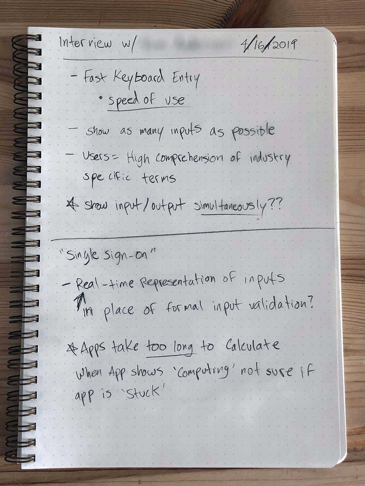
User Research
Limited qualitative user research was conducted by interviewing 6 users for one hour each. Among the topics covered by the interviews were:
- Who were the actual users of the applications.
- How users used the current applications.
- What were the pain points in each application (observed in user sessions).
- What feature sets should be included in future applications.
User Goals
In the interview process with the subject matter experts, we determined four main user types as well as their motivations and goals.
- Structural Engineer (any combination of below)
- Specifier (highest structural stability, common availability, high comfort level)
- Builder/Contractor (cheapest to install code compliant building solution)
- Homeowner (highest structural stability that I can afford)
User Journeys
We identified two separate methodologies for how the four user groups utilize the web applications. Namely a Linear Workflow where users would fill out all required inputs to the best of their knowledge and then receive the results. The second methodology was an Iterative Workflow (trial and error) where users would also fill in the required inputs and receive their results but then would further iterate and edit the inputs to achieve the desired outputs.
A map of the persona’s to the different methodologies is:
- Structural Engineer - Iterative Workflow
- Specifier - Linear Workflow
- Builder/Contractor - Iterative Workflow
- Homeowner - Linear Workflow
Research Findings
The following findings were identified during the research phase:
- A "Mission Control" style interface where all items are viewable at once was preferred by power user
- Condensed layout
- Ubiquitous input/output (side by side)
- More keyboard, less mouse ---> this, as a result, killed pagination
- Table of contents was deemed unnecessary
- Search was deemed unnecessary
- Logged-in state was desired, but beyond budget & scope
- PDF printing was desire could be satisfied by well executed CSS & OS print to PDF capabilities
- 75% Desktop users drove a desktop first approach, tablet & mobile were still of required implementation
UI/UX Solution Implementation
The Workspace
In keeping with our research findings of providing as many inputs on screen and therefore viewable to the user, the Blueprint workspace crafted to take over the entire viewport with a 100% width. The application would no longer be constrained within the main website’s wrapper and thus, would appear akin to a native app. Along these lines, the main site’s massive header and footer would be ditched as the metrics indicated users were unlikely to navigate elsewhere on the site via the top navigation once an app session began.
Input/Output Relationship Redux
- Desktop layout: side-by-side resizable input/output panes
- Tablet layout: top and bottom resizable panes
- Mobile layout: singular input or output view with floating action button to switch between views
Desktop Layout
The research showed the want for viewing both the input and output sections concurrently, and we decided to lay them side-by-side for desktop viewports with independent scrolling on the y-axis for both should they overflow. Additionally, we chose to make the panes resizable with a center “resizer” section so users could configure their workspace to their liking.
Tablet Layout
For tablet viewing with a portrait orientation, we changed the layout so that the input would be on top of the output section. Tablets in landscape mode would share the desktop side-by side look. Regardless of orientation, the size of the panes would be resizeble for tablets, too.
Mobile Layout
As mobile devices have a very limited screen size it was decided to show only the input or the output section exclusively. Users could quickly switch between sections by toggling a “I/O” button on the lower right of screen. This location was chosen for easy activation by the thumb on right-handed individuals as they make up nearly 70% of the population. We hypothesized that the input/output button would be the most important button on the mobile application for the iterative workflow and thus wanted to maximize its usefulness.
Navigation
We decided on a small, fixed header (50 px height) to contain all the necessary global actions users would need within the application as well as branding for both the app and Simpson Strong-Tie. The following actions were given alloted slots within the header:
- Save (future release after single sign-on is incorporated)
- Upload
- Download
- About
- Reset
- Settings
- Apps (future release after single sign-on is incorporated)
Desktop Navigation
The desktop navigation would carry the full suite of action buttons as this was the prefered experience according to our metrics. Additionally, the desktop version would show the app’s icon for branding purposes.
Mobile and Tablet Navigation
The mobile and tablet experience differed from the desktop version in that users could not upload and download files as this would not work on iOS devices as of when the framework was developed. It should be noted that 70% of our mobile and tablet users were using the iOS operating system.
As space was a concern on phones and tablets, we knew that the horizontal screen would not accomodate a sea of buttons as would a desktop. As such, we abstracted the action buttons into a vertical format that would be toggled on and off via the ubiquitous hamburger button.
Instant Gratification and the Happy Path
One major pain point of the legacy applications was when users would enter data in the form fields, hit the calculate button only to find it did not map to a valid result. It was decided to bypass that flow by calculating an output whenever a form field is changed and has triggered a blur event. The user would quickly see any changes to their results in the output pane or be notified if the inputs did not map to any result.
In order to facilitate this quick results output, we need to preset the application with a happy path that would be guaranteed to deliver a valid result. We used this opportunity to preload the inputs with what our structural engineers determined was the most common scenario asked by our customers.
The Reset Button
Our legacy applications all shared a reset button somewhere on the application to return the form inputs to their default values. Similarly, we added the reset to the top navigation to return the app to the default happy path. According to the metrics on our previous applications, the reset button was the second most commonly activated button after the calculate button. With this in mind we hypothesized that adding an duplicate reset button as a floating action button in the lower right corner of the output pane would be advantageous to customers as it would be prominent but not in the way of viewing content. In the mobile view, there would be only the secondary reset button and it would be placed just above the input/output button.
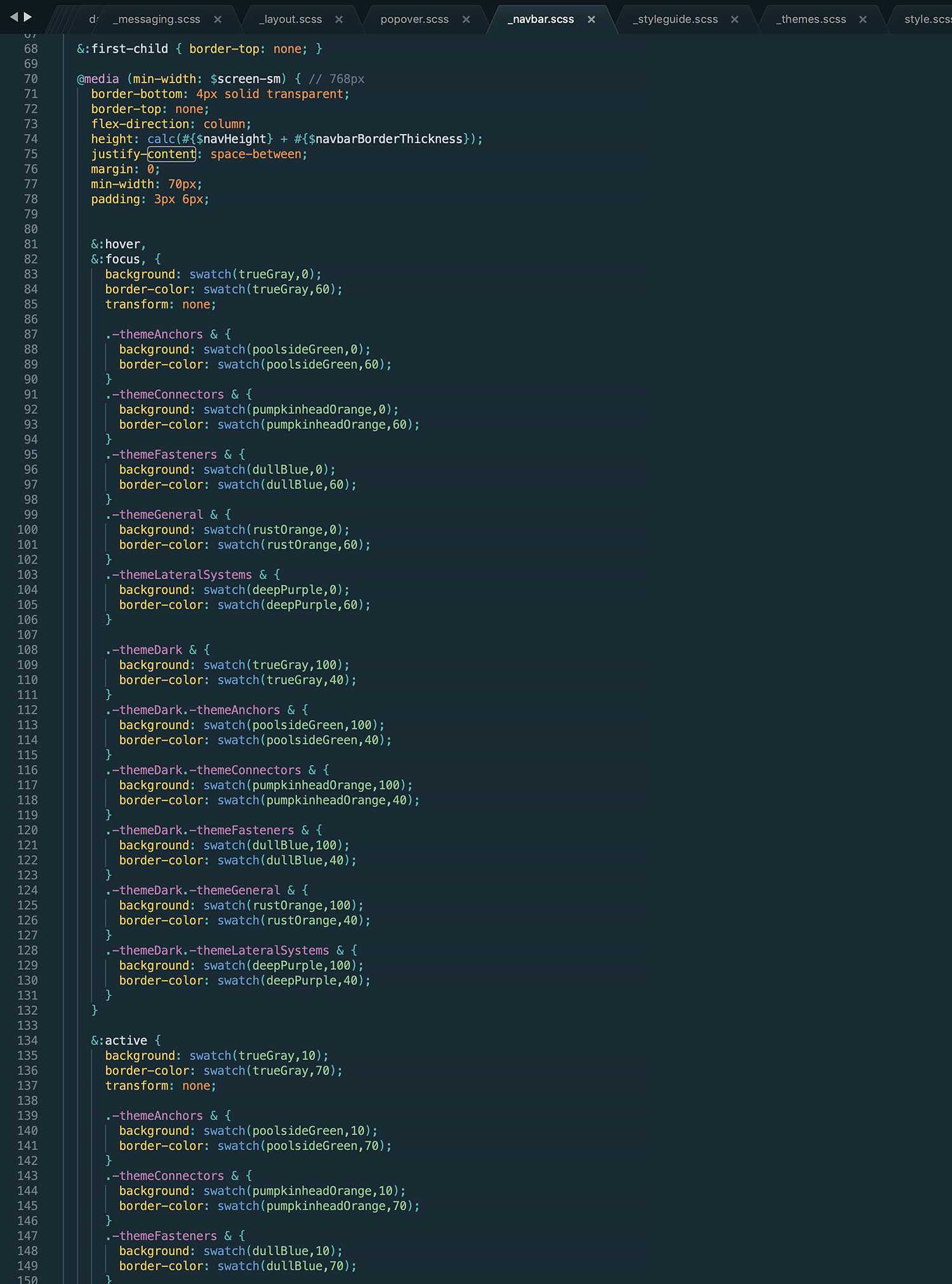
Themes, Modes, and Customization, Oh My
Themes
Web and desktop applications at Simpson Strong-Tie are branded with coloring to indicate which product line they support. There are six main product lines for applications. We decided to colorize the Blueprint apps accordingly along with adding a seventh, non product lined themed coloring just in case the need arose. The color themes along with their respective product lines are:
- Pumpkinhead Orange → Connectors
- Deep Purple → Lateral Systems
- Dull Blue → Fasteners
- Poolside Green → Anchor Systems
- Rust Orange → General
- True Gray → Default
Modes
Blueprint applications support both light and dark mode for both desktop and mobile OSs that nativuly support this. Additionally, each application can be customized for the UI to be viewed in light or dark mode for older operating systems or to override the current system settings. Setting the app to either mode would be a global setting stored in local storage for future browsing sessions.
The dark mode UI was a challenge that was more complicated than just making the background black and the text white. We learned that too much contrast in dark mode would just plain hurt the eyes and cause strain. We settled on on a dark gray gradient for the main background and a near-white type gray (#e2e2e2) for the main text and a lighter near-white (#f2f2f2) for the headlines to make them pop a bit more. Another item that needed to be dialed back was the images. We settled on presenting the svg, line drawing images at a 85% opacity to not jump out too much and take over the visuals for the entire workspace.
Customization
In addition to setting the mode of the application, users are also able to configure the app to their prefered orientation for the input and output panes when in desktop viewports. As with the mode, this setting is stored in local storage and overrides the default orientations.
The last customization we built in was the ability to alter the global font size to small, medium, or large with medium being the default. The large text size aids those with visual impairment and the small text size allows more information to be shown on the screen. This setting overrode the default text size on the <html> element and as the framework is built on REMs, it would cascade downwards throughout the DOM and its associated classes.
It should be noted that we do not allow for customization in the mobile experience as it is unnecessary. As such, the mode in the mobile view is derived from the OS while the font size is set to medium. As stated before, the mobile view is always one pane at a time.


SCSS Methodology
The framework UI was built with SCSS utilizing a top-down architecture using a small set of modifier classes the applied <html> tag to allow theming, modes as well as other customizations for branding. We chose this approach as opposed to an external theme .SCSS file due to the small size of the engineering team.
To maintain order within the SCSS files, we chose to use an altered version of BEM (Block Element Modifier) methodology for the consistency and order that comes with BEM but without the overly long and repeated class names, e.g., .dropown__label .-focused.
We scoped the SCSS files to the individual React components so that if a component was never loaded, the corresponding SCSS file would not be either to decrease page weight. It should be mentioned that we chose to use SCSS over React Stylized Components as while Stylized Components is extremely fast, it does not provide the pinpoint control SCSS does for complex UIs and it quickly devolves into difficult to manage and maintain consistency between components within a larger ecosystem of a framework.
Style Guide
The Blueprint framework’s styles, icons, and React components are presented within a style guide built on the React Styleguidist library utilizing markdown files. The style guide displays the props and api for each component as well as a hot-loadable playground allowing front-end engineers to play with code snippets independent of actual applications.
Furthermore, we built in the functionality to quickly change the mode and theme of the style guide on-the-fly with the right-hand button-group to allow users to view components or other design patterns in light or dark mode, or in any of the seven brand theme colors.

Success Ideals
Company Defined Success
- Simpson Strong-Tie aims to build and deliver 4-6 new applications per year with the Blueprint framework
- Anticipated output with Blueprint for 2020 is 3 complete original applications
- Increased utilization analytics (on the application level)
- How efficiently applications can be produced
Design Related Success
- Are users utilizing the applications the way they desire or how the UX was intended for them too? (can be tracked using Google tag manager)
- Are users achieving success (generating reports, finding products, etc)
- How efficiently are customers able to find the desired results compared to the legacy applications
Next Steps
The Blueprint framework still requires many design patterns to support the upcoming application backlog. By its nature, it will never see an actual completion date but rather a constant evolution of new parts as well as UI/UX design iteration to better service its core audience and clientele.
Upcoming New Features
- Single user sign-on
- Multi-application dashboard (sharing data between apps)
- 3D webGL capabilities for viewing realistic renders of products
- Integration with B2B e-commerce platform
Summary
Blueprint Current Status
As of February, 2020, the beta version of the Blueprint framework launched with a core set of design patterns and components available for use in apps. Along with the framework, the beta version of the Post-to-Foundation Designer (PFD) has been released as well. The PFD is the first single-page application to use Blueprint. We are aiming for a Q2, 2020 public launch for this application.